What 'premium' actually means in web design (it's not animations)
Premium isn't glassmorphism, parallax or a dark theme. It's the absence of doubt. Here's what actually makes a site feel expensive.
Clients often ask for a 'premium' website and show references full of floating cards and gradient meshes. But look at the sites of genuinely premium brands: they're calm. What reads as expensive is precision, not decoration.
The real signals of quality
- Typography with intention — a real hierarchy, not five random font sizes
- Space — premium design is generous with emptiness because it isn't desperate
- Speed — nothing cheapens a site like waiting for it
- Words — specific, confident copy instead of 'innovative solutions'
- Consistency — every page feels like the same hand designed it
Why restraint converts
Every effect competes with your message. Visitors don't remember your parallax; they remember whether they understood what you do and whether they trusted you. Restraint isn't a style choice — it's respect for the visitor's attention.
Premium is the absence of doubt: about what you do, what it costs the visitor to find out, and whether you sweat details.
Related articles
Back to all insights
Your business doesn't need a website. It needs a digital system.
A website that just sits there is a cost. A digital system — site, visibility, follow-up, automation — is an employee that never sleeps. Here's the difference.
The digital opportunity for businesses in Suriname
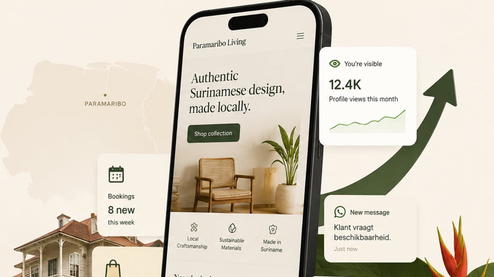
Most Surinamese businesses compete offline while their customers search online. That gap is the biggest commercial opportunity in the country right now.
Five processes every small team should automate first
You don't need an AI transformation. You need the five repetitive tasks that eat your week to run themselves. Start here.