Naar inhoud
BrandingWeb DevelopmentUX/UI

Blackoak Creative

A second brand built from nothing: an independent creative studio with its own name, voice and Dutch-first site — identity, art direction and front end, designed and built end to end.

Opdrachtgever
Self-initiated — own studio brand
Sector
Creative Studio
Land
Suriname · Netherlands
Jaar
2026
Blackoak Creative — Creative Studio

Impact

2

languages — Dutch first, English alongside

7

concept projects built out as full case studies

6

disciplines under one studio

01

Uitdaging

A personal name carries a personal ceiling. To a business owner in Paramaribo, “Eugenio Díaz, Digital Product & Growth Partner” reads as foreign and expensive, and it cannot be handed to anyone else to sell. A local market wants a studio it recognises, in its own language, with a name that sounds like it belongs here.

02

Strategie

Build a brand, not a second company — the same operation underneath, a separate identity on top. Dutch first, because that is the language the market buys in. One image carrying everything: the oak — roots, growth rings, something built to outlast the brief. Then make the site itself the proof rather than the promise.

03

Oplossing

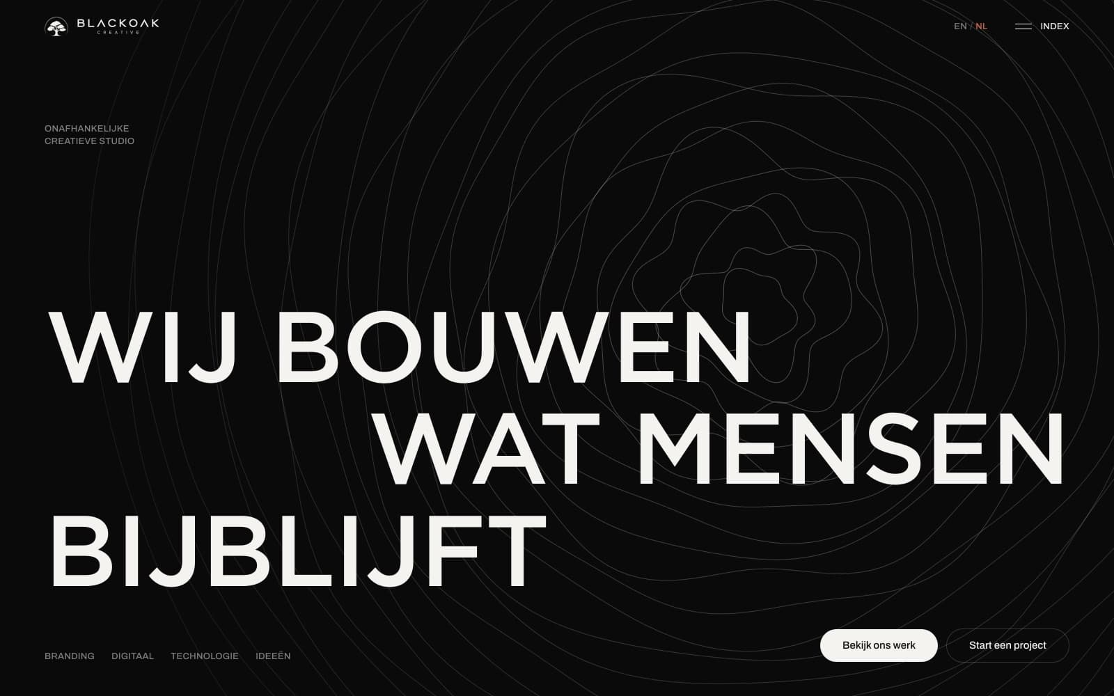
A complete studio identity and a bilingual site in Dutch and English around a single visual idea. Near-black canvas, off-white type, one coral accent; concentric growth rings drawn behind the headline; circular image crops as the shape that repeats everywhere. Dark index pages set against light case-study pages, so moving through the site has a rhythm. Seven concept projects, six disciplines, and a studio page that says plainly that the people you talk to are the people doing the work.
The work, up close

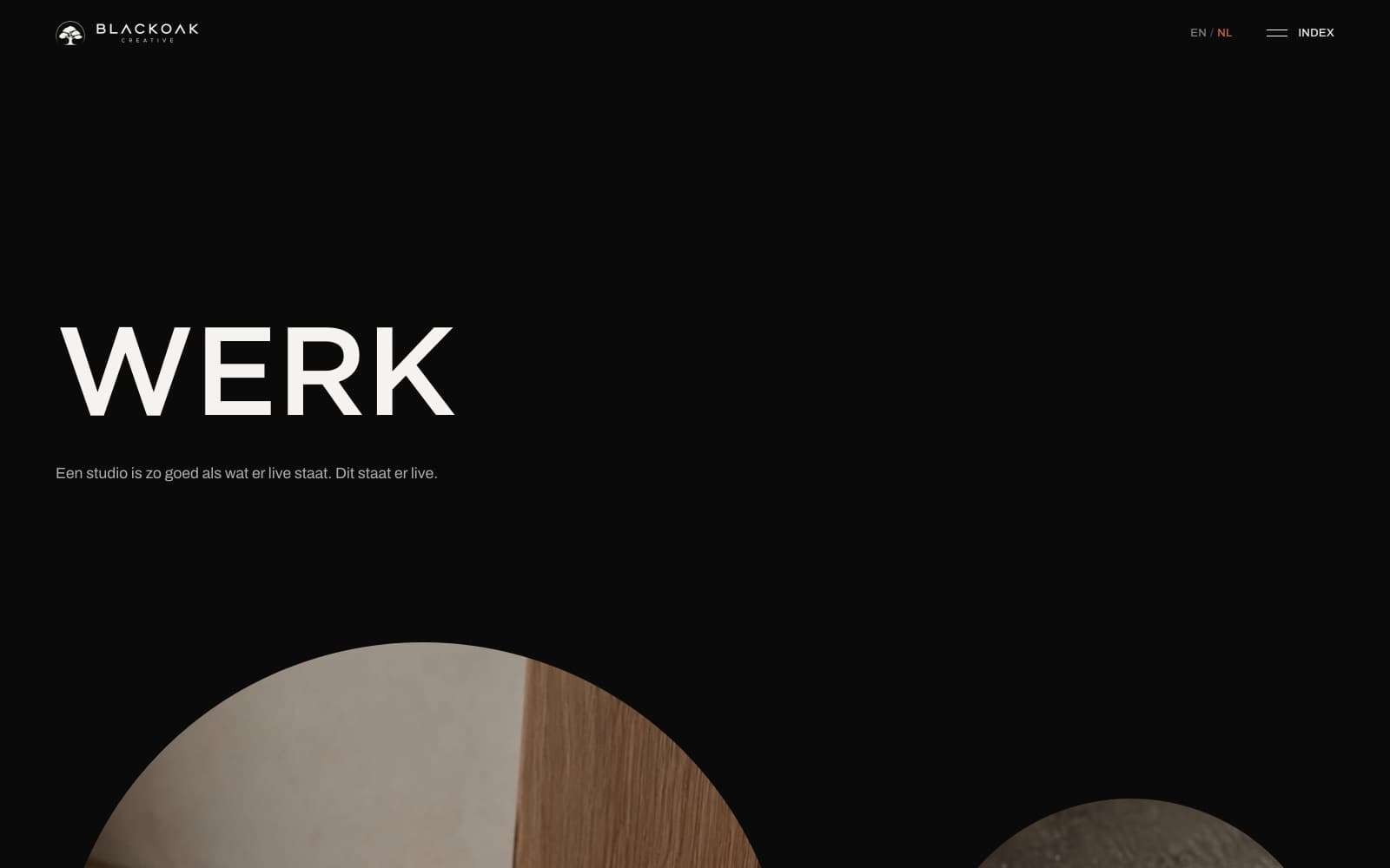
Blackoak Creative work index: the word WERK set very large in off-white on near-black, with circular crops of the first projects appearing below
Work index — dark page, circular crops, one shape repeating
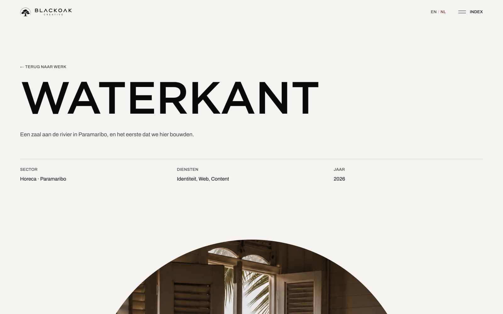
A Blackoak case study page on off-white paper: the project title set large in black above a metadata row of sector, services and year, with a circular photograph below
Case study — light page against the dark index, metadata before imagery
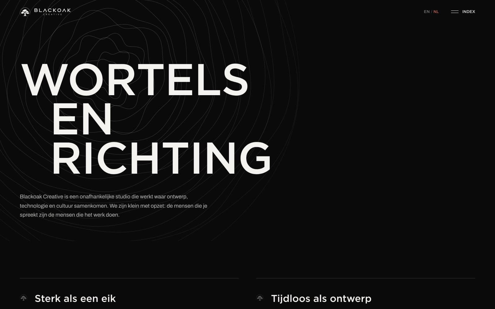
Blackoak Creative studio page: “Wortels en richting” in off-white over faint concentric growth rings, with the studio statement in Dutch beneath
Studio page — the oak metaphor carried into the background art
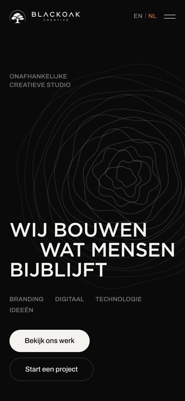
Blackoak Creative home on a phone: the growth-ring mark centred behind the headline, with the discipline list and two stacked buttons below
Mobile — the growth rings read strongest at phone width

Proces

  1. 01Positioning first — a Dutch-speaking studio brand, separate from the personal name
  2. 02Name and mark: the oak, carried through into growth rings, icons and copy
  3. 03Art direction — near-black and off-white, one coral accent, circular crops as the constant
  4. 04Bilingual content structure with Dutch as the primary language, English alongside
  5. 05Front end built and shipped: work index, case studies, services, studio and contact

Geleverde diensten

  • Brand identity
  • Art direction
  • Web design
  • Front-end development

Technologieën

Next.jsTailwind CSSCloudflare
Bekijk live site

Gevestigd in Suriname · Wereldwijd actief

Have a similar challenge?

Every project here started with a conversation about the business, not the technology. Yours can start the same way.